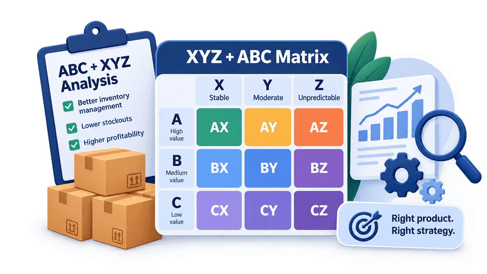
Why you need two letters
ABC analysis answers the question "how much does this item bring in". XYZ analysis answers "can it be relied on". On their own, each answer is incomplete, and the decisions taken on them are lopsided.
Look at two items from the demonstration data set. A 60/40 coffee-bean blend — 42,032 units a year, the largest item in the assortment. Shortbread biscuits — 34,378 units, also class A. By ABC they are neighbours, and the rules for them ought to be the same.
But the coefficient of variation is 76.8% for the coffee and 7.6% for the biscuits. The biscuits move evenly and can be ordered on a schedule. The coffee sits still for half the year and then shifts three times as fast in summer. The same rules for both mean either an empty warehouse in July or money frozen in February.
Two letters instead of one solve exactly that. The first says how much the item brings in, the second how evenly it does it. The coffee gets the code AZ, the biscuits AX, and the work with them differs at a glance at the report.
How the code is built
The code is two letters in a row, and their order is fixed.
- The first letter is ABC: the item's contribution to the total. A is the largest, C is the tail.
- The second letter is XYZ: the spread of sales across the periods. X is even, Z is erratic.
That gives nine combinations: AX, AY, AZ, BX, BY, BZ, CX, CY, CZ. Together they are called the matrix — three ABC rows by three XYZ columns.
The order of the letters has to be remembered. AZ and ZA are not two spellings of one cell: AZ reads "a large item with erratic demand", and the reverse order is not used in industry tables at all. The tool prints the letters in the order ABC → XYZ, that is, from AX to CZ.
The good news: nothing new has to be calculated. Both letters come out of the same twelve columns you selected — they are simply read in different ways. How each one is calculated is covered in the article on XYZ analysis and in the article on ABC.
Where the first letter comes from
This is where people stumble most often: it feels as though ABC needs a separate column with an annual total or with revenue. It does not.
The tool adds up the selected columns itself. It takes the same periods it uses for the spread, sums them along the row, and sorts the items into A, B and C by that sum. The sum is shown in the report as its own column — SUM — so the basis for the letter can always be checked by eye rather than taken on trust.
From this follows a rule that matters more than it seems: ABC comes out in whatever your columns measure. Feed it units per month and the split into A, B and C will be by units. If you need ABC by money, feed money per month rather than quantity. The same columns feed both letters, so the spread will then be calculated on money too; that is perfectly valid, you just have to know what you are measuring.
In the demonstration data set the columns are in units, so the contribution is counted in units as well. The result: A — 24 items and 80.5% of the volume, B — 30 items and 14.6%, C — 66 items and 4.9%.
Not to be confused with complex ABC
There is a second analysis with a two-letter code, and it is something else entirely.
Complex ABC compares two money figures with each other — revenue and profit, say, or sales and stock on hand. Its codes look like AA, AC, CA … CC: both letters there are about contribution, just on different columns. It answers the question "where does money disagree with money": an AC item sells a lot and earns little.
XYZ+ABC compares contribution with behaviour over time. The second letter here is not about money at all, but about how even the demand is. Its answer is a different one: "where is money standing on unpredictable demand".
Telling them apart in a report is easy — look at the second letter. If it is A, B or C, you are looking at complex ABC; if it is X, Y or Z, it is XYZ+ABC. A detailed walk through the nine money cells is in the article on complex ABC analysis.
AX — the core of the assortment
Large items with even demand. This is the calmest part of the list and the reason the analysis is done at all.
In the demonstration data set AX holds 12 items — 10% of the list, producing 39.9% of the total volume. Every tenth row makes almost forty per cent of the turnover, and makes it predictably.
What people do with them:
- order on a schedule — a reorder point, a minimum balance and regular deliveries all work here;
- hold a minimal safety stock — demand is even, there is not much to insure against;
- negotiate on price — these are items with a predictable volume, and it is for them that terms are bargained with the supplier.
The main mistake with AX is not to touch them at all, because "everything is fine as it is". The money saved in the warehouse comes mostly from here: taking a week's stock out of the core is worth more than clearing the whole tail.
AZ — the main risk
Large items with erratic demand. If you are going to look for one cell in the report, look for this one.
In the data set AZ holds only 4 items — 3.33% of the list. Yet they account for 14.6% of the annual volume. Three and a half per cent of the rows hold every seventh unit sold, and that demand cannot be predicted from an average.
The largest of them is that same 60/40 coffee blend: 42,032 units a year at a coefficient of variation of 76.8%. It is at once the top row of the report by volume and the item for which planning does not work.
Hence the risk: an error in AZ is expensive in both directions. Too little, and you lose sales on your best-moving item. Too much, and you freeze money on a scale comparable to a whole B class.
What people do:
- work out the reason for the spread — a season, promotions, one large customer, or simply uneven demand. Those are different diagnoses and different decisions;
- insure the stock deliberately and count what it costs — safety stock is most expensive in AZ, and it is a conscious payment for availability;
- shorten the ordering horizon — more often and in smaller batches, if the supplier allows it;
- negotiate returns or deferred payment — on a large unpredictable item that is worth a conversation.
CZ — the dead tail
Small items with erratic demand. The most populated cell in almost any assortment.
In the data set this is 27 items — 22.5% of the list against 2.3% of the volume. Every fifth row of the report brings in 13,713 units a year between them: less than half the annual sales of a single item from the core.
The temptation is obvious — clear it out. But before clearing, it is worth looking at why an item ended up here, because several completely different things land in CZ:
- a new product that has only just started selling — growth is ahead of it, and the zeros at the start of the year produce a huge spread;
- a fading item that people have stopped buying — the zeros at the end produce the same spread, but the decision is the opposite;
- a rare but necessary product — bought once a quarter, yet without it the customer does not come;
- a small seasonal line that lives for two months a year.
The first two look almost identical in the report, and what you should do with them is exactly opposite. How the tool tells them apart is covered in the third article in the series.
What people do with the rest of the tail: move it to order-on-demand, consolidate batches so as not to ship one unit at a time, and drop whatever holds neither a customer nor a shelf.
The other six cells in brief
The three cells above are the extreme cases. Between them lie six more, and the decisions there are gentler.
- AY — large, fluctuating within understandable limits. 8 items, 26.0% of the volume: the second-biggest cell by money in the data set. Treated like the core, but with a larger safety stock.
- BX — mid-sized with even demand. 14 items, 6.2%. Candidates for automatic ordering: the core's rules work and the cost of an error is lower.
- BY — mid-sized with fluctuations. 9 items, 4.6%. An ordinary safety stock, nothing special.
- BZ — mid-sized with erratic demand. 7 items, 3.8%. The same choice as in AZ, but cheaper: working to order makes more sense here.
- CX — small but even. 14 items, 1.0%. The most convenient part of the tail: ordered automatically and needs no attention.
- CY — small with fluctuations. 25 items, 1.6%. Looked at together with CZ when pruning the assortment.
The general rule: the higher the first letter, the more an error costs; the further the second is from X, the less you can rely on an average.
How to read the matrix in the report
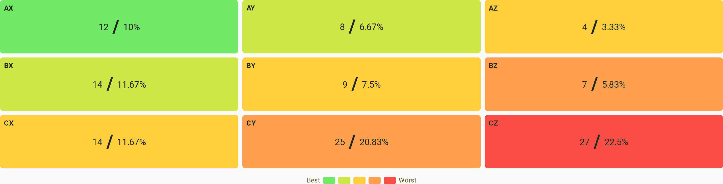
Above the report table the tool draws the matrix: nine cells, each showing how many items landed there and what share of the list they make up. Clicking a cell filters the table below it, so AZ is one click away from four specific rows.
And here is the main thing to know when reading it: the percentages in the matrix are a share of the number of items, not of the money. AZ shows 4 items and 3.33% — three per cent of the rows, not three per cent of the turnover. The turnover there is 14.6%, and the matrix does not show that figure at all.
The difference is enormous, and confusing it is dangerous in both directions:
- by count, CZ looks like the most important cell in the report — 22.5% of the list. By money it is 2.3%;
- by count, AZ looks like a detail — 3.33%. By money it is a seventh of the whole turnover.
The share in money is read in the table itself: for XYZ+ABC the tool adds three columns to yours — the coefficient of variation, SUM and the cell code. Filter by a cell and add up SUM to get the group's contribution. The reading order is the same as in XYZ analysis: the overall picture from the matrix first, then AZ by descending SUM, then the core.
Common mistakes
Reading the matrix percentages as money. The most common and the most expensive: on that reading the tail looks like the main problem of the assortment and AZ like a detail. It is the other way round.
Assuming you need a separate total column. The tool adds up the selected periods itself, and an extra column with the annual total, selected alongside the months, only spoils the calculation: it goes into both the sum and the spread as one more "period".
Confusing it with complex ABC. The codes AA…CC and AX…CZ look alike but answer different questions. Look at the second letter.
Grouping cells into "good" and "bad". AZ and CZ both end in Z, and the decisions on them are opposite: one is insured with money, the other is dropped from the assortment. The matrix exists precisely to tell them apart.
Applying the core's rules to the whole of letter A. AX is ordered on a schedule; AZ cannot be ordered that way — that is exactly the case that produces an overfull warehouse and stockouts at the same time.
Drawing conclusions from one cell without looking at its size. Four items in AZ are statistics from four observations. The decision is taken by looking at the items themselves, not at the cell's share.
What next
The matrix says what to do with a group. It does not say why an item landed in that particular cell: behind the letter Z hide a season, growth, decline and a new product — and the decisions differ although the letter is the same.
- What XYZ analysis is — in plain language — where the second letter comes from;
- What ABC analysis is — in plain language — where the first one comes from;
- What else the tool sees in your periods — trend, seasonality, dead stock and new products behind the same figures.
Run your own file
Upload your monthly sales and see how many items you have in `AZ` and how much of the turnover rests on them. The calculation runs right in your browser — the file is never sent anywhere.
Open XYZ+ABC analysis