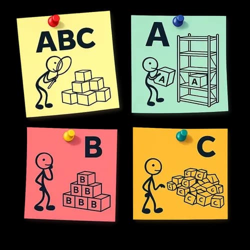
What ABC analysis is
ABC analysis answers a single question: what on your list produces most of the result, and what produces almost none of it.
The list can be anything — products, services, customers, suppliers, sales reps, branches. So can the result: revenue, margin, units sold, hours worked. The method takes one column of numbers and splits every row into three groups:
- A — the ones that account for most of the result;
- B — the middle;
- C — the long tail, which together adds up to very little.
The value of the method is not that it calculates percentages — Excel does that too. The value is that afterwards the list stops being uniform. Group A cannot be handled the same way as the tail: the cost of a mistake is different, the priority in purchasing is different, and so is the attention they deserve.
What follows is how it works, how to read the result, and where people go wrong most often.
Where the 80/20 rule came from
The observation that contribution is distributed unevenly is usually traced to Vilfredo Pareto: in the late nineteenth century he noticed that a small share of owners held a large share of the land, and similar imbalances were later found in all sorts of data. It reached inventory management in the middle of the twentieth century already as ABC classification: split the range into groups and manage them differently, instead of spending the same effort on everything.
Hence the famous phrasing, "20% of items produce 80% of the result". It should be handled with care.
80/20 is a reference point, not a law. Your real proportion is almost certainly different: it may be 10/80, it may be 35/80. That proportion is the meaningful answer, not the confirmation of a neat number. The smaller group A is, the more the business depends on a narrow set of items — which is efficiency and risk at the same time.
So the right order is this: calculate first, then look at what came out. Not the other way round.
How it is calculated
The mechanics are simple, and it pays to understand them — otherwise the result looks like magic.
- Take one column of numbers. Annual revenue per item, for example.
- Sort it in descending order. Whatever produced the most goes on top.
- Calculate each item's share of the total. All the shares together make 100%.
- Go from the top down, accumulating as you go. Until the running total reaches the first threshold, it is class A. From there to the second threshold, B. Everything left over is C.
Thresholds are set as percentages of the result. The default is 80% / 15% / 5%: class A fills up to 80% of the result, B adds the next 15%, C the last 5%.
There is a subtlety here that sometimes makes the numbers look odd. An item is assigned its class by the accumulated share of the items strictly larger than it — that is, by the total collected before it. Two useful properties follow:
- an item that crosses a threshold stays in the current class instead of being pushed into the next one;
- the largest item always lands in A — even if it alone produces more than 80% of the result.
The second property matters more than it seems. Without it, the one item that dominates your assortment would end up in class B, and the report would mislead precisely where the cost of a mistake is highest.
Two shares that are easy to confuse
This is the main source of misunderstanding when reading any ABC report, so I will spend some time on it.
Two different percentages keep coming up in conversations about ABC:
- the share of the result — how much revenue (or margin, or units) falls to a class;
- the share of the item count — how many rows from the list ended up in that class.
These are completely different numbers, and confusing them means drawing the wrong conclusions.
Look at the example. The demonstration file has 200 items, and with the default thresholds it came out like this:
- class A — 40 items, that is 20% of the assortment, and they produce 80% of the revenue;
- class B — 50 items (25% of the assortment) — 15% of the revenue;
- class C — 110 items (55% of the assortment) — 5% of the revenue.
The first number in each line is about count, the second about money. The matrix in the report shows the count: "A — 40 / 20%" means forty items, that is twenty percent of the assortment. Whereas "class A produces 80% of the result" is already about revenue.
The sentence "class A is 80%" means nothing without a qualifier: 80% of what? If someone tells you that "group A is twenty percent", always ask twenty percent of what exactly.
What A, B and C mean — and what they do not
The classes are a priority of attention, not a verdict of "good / bad".
A — what you cannot afford to lose. This is where a mistake costs the most: running out of these items hits the result harder than anything else. They are kept in stock, they get priority in supplier negotiations and in promotions, their stock levels are checked more often. The flip side is concentration of risk: the shorter list A is, the more exposed the business is.
B — the working middle. Standard management and periodic review. This is also where the most interesting growth material hides: candidates for moving up into A. If an item in B is growing steadily, it is worth spotting before it reaches A on its own.
C — the long tail. Large infrequent orders, minimum working capital, automatic replenishment. Part of the tail consists of candidates for discontinuation.
And now the important part, the one that is frequently written up incorrectly.
Class C is not "the unprofitable items". ABC knows nothing whatsoever about losses: it splits the list by contribution to the metric you gave it. A low contribution to revenue and a loss are different things. An item in C may carry a high margin, it may provide the completeness of the range that brings customers in for everything else, it may be a new product that simply has not built up turnover yet. "Drop everything in C" is the most expensive mistake this report provokes.
The correct phrasing is gentler and more useful: C is where it is worth looking for candidates to discontinue, not a list of the condemned. Before you drop an item, look at its margin, at its role in the range, and at how long ago it appeared.
Symmetrically: A is not "the best products", it is "the ones that weigh most in this metric". Run ABC on revenue and on margin — the two A lists will diverge, and that disagreement is a useful conclusion in itself.
Category thresholds: when to change 80 / 15 / 5
The thresholds are not dogma but a setting, and they change the answer.
Move the first threshold from 80% down to 70% and class A becomes shorter and stricter. Raise it to 90% and it swells up, losing the whole point of being a short list of priorities.
Signs that it is worth changing them:
- A came out too large (half the list, say) — which means the contribution is spread evenly and there is no concentration. Lower the threshold, or you will end up with more "priority" items than you can physically keep under control.
- A came out as a handful of items — the concentration is very high. You can leave the threshold alone, but it is worth thinking separately about the risk: what happens if one of those items falls away.
- You are comparing periods — keep the thresholds identical, without exception. Otherwise the comparison is meaningless: the changes in the report will reflect your setting rather than the behaviour of the business.
That last point belongs in your written procedure. ABC is useful not as a single run but as repeated runs on identical settings.
What to feed in
A few rules here will save you time.
The metric has to be additive — something it makes sense to add up. Revenue, margin, unit counts, hours, number of enquiries all qualify. Average order value, markup in percent, conversion rate do not: the method sums contributions, and a sum of percentages means nothing. If you need a view by margin, use margin in money, not margin as a percentage.
One row, one entity. If the same product appears in the file as ten rows (by day or by invoice), collapse them into one first, or the method will classify individual sales rather than products.
Choose the period by how often you transact. Usually that is somewhere between a month and a year. The reasoning is simple: the sample needs enough events for contribution to be stable. If you sell three houses a month, a monthly ABC will describe randomness rather than structure. In retail with hundreds of receipts a day, a month is plenty.
Comparability matters more than completeness. Do not put things that live by different economic rules into one table — wholesale and retail sales, different lines of business, products and services. An item that is expensive by the standards of one line will be cheap by the standards of another, and the groups will come out meaningless. Two runs by segment beat one run across everything at once.
Negative values (returns, adjustments) should be cleaned out or netted off against sales into non-negative amounts — otherwise the shares stop meaning anything.
What it looks like in practice
I will show it in CheckBusiness, where ABC is laid out in four steps and nothing has to be calculated by hand. One thing worth stating separately: the calculation runs right in the browser, the file is never uploaded anywhere. For files with customers or patients in them, that is fundamental.
Step one — open the XLSX file.

Step two — mark the column to calculate on. Classic ABC needs exactly one: here it is "Annual revenue". Before that you can see the first rows of the file — a convenient moment to check that the headers were recognised and that the column is numeric rather than text.
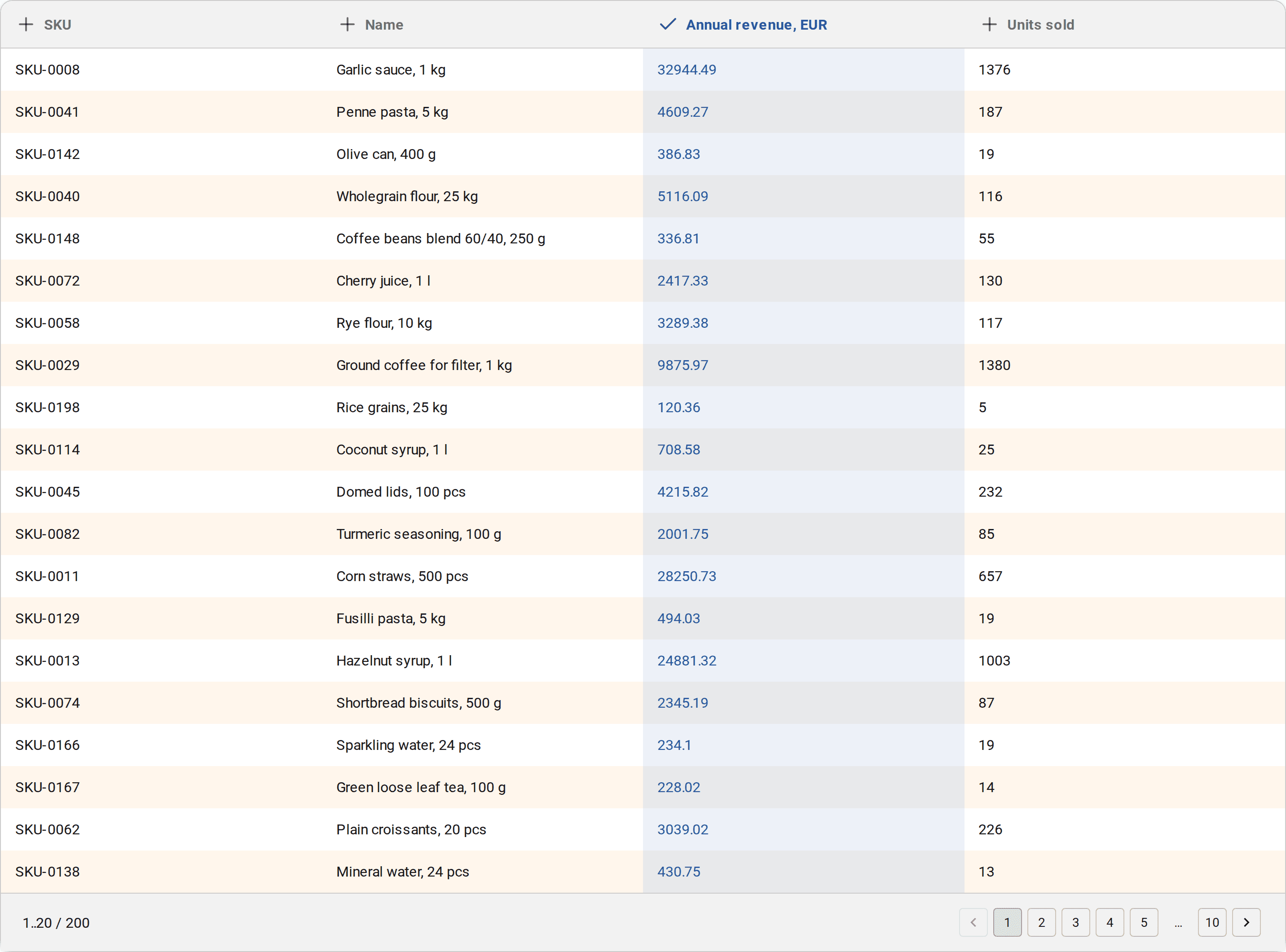
Step three — the category thresholds. The default is 80 / 15 / 5, and for a first run that is a sensible starting point.

Step four — the report.
How to read the report
The first thing the report shows is the class matrix. Each cell holds the number of items and their share of the list.

It reads like this: forty items out of two hundred landed in A, which is twenty percent of the assortment. A reminder from the previous section — the percentages here are about count, not money.
A cell can be clicked, and the table below filters down to that class. This is the step that turns the report into a working tool: what you get is not a picture but a list of specific items you can take to purchasing.
The table itself is your own file plus two columns added by the calculation: the item's share of the total and the class assigned to it.
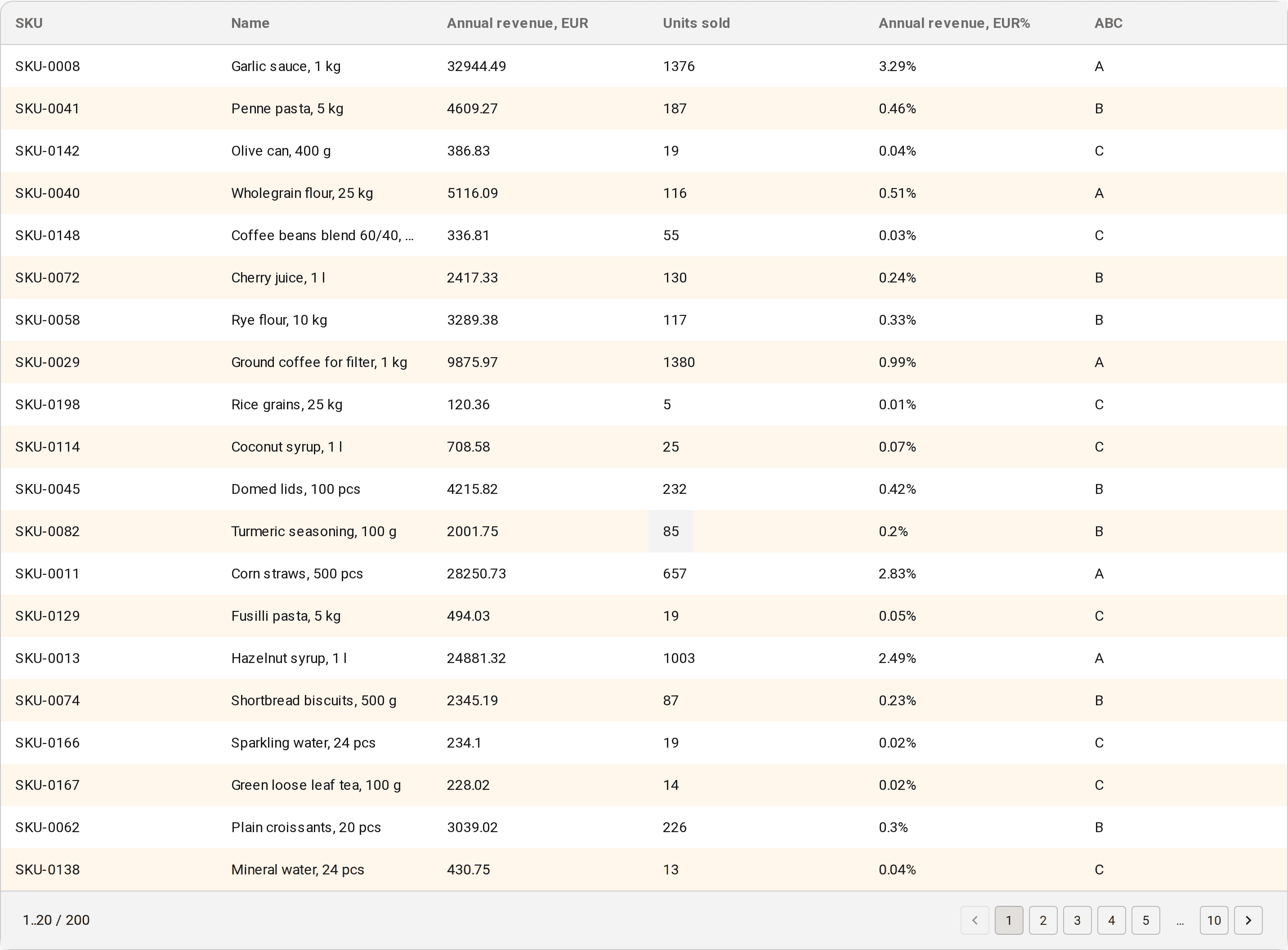
The report is saved to XLSX from the same place — after which you can work on it with the usual tools: pivot tables, filters, or send it to your buyer.
Recommendations: from classes to actions
Classes on their own are not yet a decision. So the report comes with an analysis of what is actually worth doing about this structure.
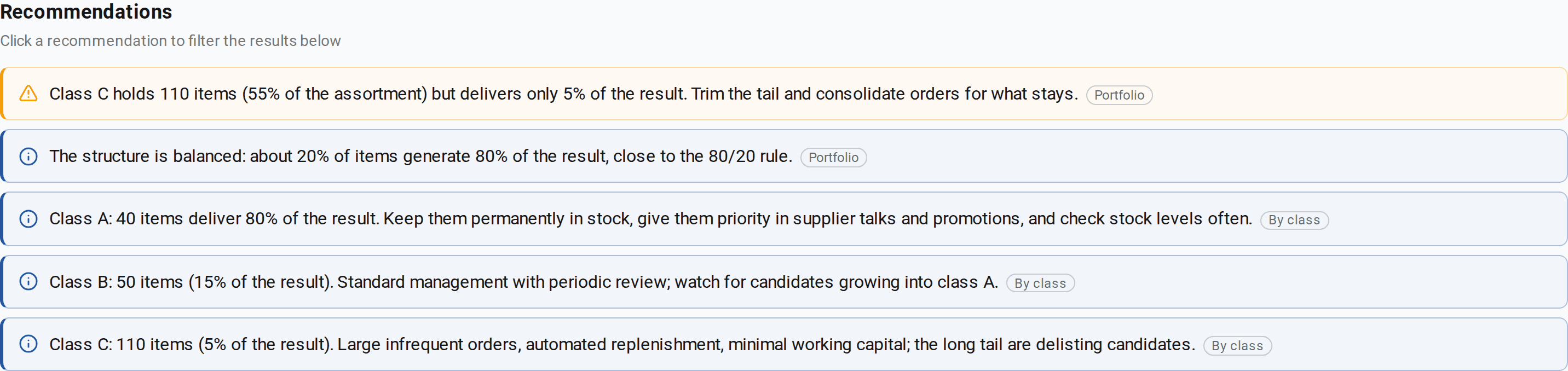
Our example has five prompts, and both kinds are visible among them. The first one is a warning about the portfolio: class C is 55% of the assortment for 5% of the result, so the tail is worth trimming and the orders for whatever remains are worth consolidating. Then comes the second portfolio prompt: "about 20% of items generate 80% of the result, close to the 80/20 rule" — meaning the structure is balanced. The order is not accidental: whatever is flagged as a warning comes first, and the rest follow by decreasing share of the result.
The remaining three prompts are per class: what to do with A, what to watch in B, how to handle C. By default the panel shows the first four and hides the rest behind a "Show 1 more recommendation" line — in our report that is exactly where the class C card stays. And not every prompt can be clicked, only the ones carrying the filter icon: clicking one leaves in the table below only the rows that prompt is talking about. For the class prompts that is the whole class; the portfolio ones talk about the list as a whole, so they filter nothing.
Notice how both shares from the previous section are at work at once: in the matrix class C is 55%, in the recommendation it is 5%. The first is about the number of items, the second about revenue. It is exactly this juxtaposition that shows what the tail means.
Common mistakes
Briefly, everything people trip over most often.
- Calculating on a percentage rather than an amount. ABC on margin-as-a-percentage does not work — you need margin in money.
- Calculating "for all time". A five-year structure describes history, not today's business. Take a manageable period and repeat the run.
- Mixing the incomparable in one table: lines of business, channels, products and services together.
- Reading C as unprofitable. The method measures contribution, not profitability.
- Changing the thresholds between runs and then comparing the results.
- Stopping at the report. A table does not increase profit: what increases it is the decision taken afterwards, and the repeat run that checks that decision.
Where to go next
ABC on a single metric is the baseline. From there, two natural steps follow.
Calculate on two metrics at once. Revenue and margin, for instance, or margin and frequency of purchase. Each item then gets a two-letter code, and the mismatches become visible: high turnover on a low margin, a high margin on rare purchases. That is complex ABC analysis — it has a write-up of its own.
See how it is applied in practice. There is a management case study: the director of a medical centre works through a patient database with complex ABC and describes the decisions they took for each group and what came of them three months later.
And you can start with the simplest thing of all: export a year of sales to XLSX and see what proportion comes out for you. It is almost always different from the one you expected — and that is exactly what makes the first run worth doing.