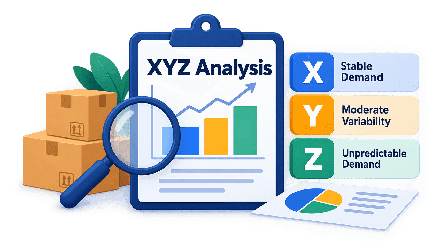
What XYZ analysis is
XYZ analysis answers a single question: how evenly each item on your list sells.
Not "how much", but precisely "how evenly". Two items can bring in the same revenue over a year and behave in completely different ways: one moves at roughly the same rate every month, the other sits still for half the year and then goes all at once. The money is the same; the work behind it is not.
The method takes sales by period — months, weeks, quarters — and splits the items into three groups:
- X — demand is steady, the future is predictable;
- Y — it fluctuates, but within understandable limits;
- Z — it is erratic, and planning around an average does not work.
The value is not in the letters themselves but in the fact that after the analysis the list stops being uniform. For X you can hold less stock and order on a schedule. For Z the safety stock is either expensive or absent, and you live with the stockouts. The decision differs — and before the analysis it is taken the same way across the whole assortment.
Why an average is not enough
Take two items and look at their quarterly sales.
The first: 100, 105, 95, 100 units. The second: 40, 10, 210, 140 units.
Both have the same average — 100 units per quarter. A report that shows only the average shows two identical rows. Yet these are two different businesses in one table: the first item can be ordered on a schedule with minimal stock, while the second barely sold in one quarter and shipped five times as much in the next.
XYZ analysis measures exactly that difference — how far the values scatter around their own average. For the first item the spread works out at 3.5%, for the second at 79.7%. The first lands in X, the second in Z.
That number is called the coefficient of variation, and it is simpler to calculate than it sounds.
How it is calculated
There are three steps, and every one of them can be checked on a calculator.
- Take the average across all periods.
- Take the standard deviation — how far, on average, the values sit from that average.
- Divide one by the other and turn it into a percentage.
That last step is the coefficient of variation:
CV = σ / μ × 100 %
- CV
- the coefficient of variation, the spread as a percentage of the average
- σ
- the standard deviation of sales across the periods
- μ
- the average sales per period
Dividing by the average is the important part. Without it the spread would be measured in units, and an item that sells in thousands could not be compared with one that moves in tens. As a percentage of its own average they are comparable: 8% is steady for both.
The standard deviation is calculated like this:
σ = √( ( (x₁ − μ)² + (x₂ − μ)² + … + (xₙ − μ)² ) / N )
- xᵢ
- sales in period number i
- μ
- the average across all periods
- N
- how many periods there are in total
Note the division by N, not by N − 1. This is the population form: we are describing exactly the periods that are in the file, not estimating the behaviour of something larger from a sample. The tool calculates it the same way — so if you are checking its result against Excel, use STDEV.P (the older name is STDEVP), not STDEV. Over twelve months the difference between the two is noticeable: about 4%.
Let us check it on the second item above. The average is 100. The deviations: −60, −90, +110, +40. The squares: 3,600, 8,100, 12,100, 1,600. Their sum is 25,400; divided by 4 periods that is 6,350; the square root is 79.7. Divide by the average of 100 and you get 79.7%.
X, Y and Z: where the thresholds come from
Once you have a percentage for each item, all that is left is to sort them into groups. The default boundaries are these:
- X — a coefficient of variation below 10%;
- Y — from 10% to 25%;
- Z — 25% and above.
These numbers are an industry convention, not a law of nature, and in your case they may turn out to be the wrong ones. The reasoning behind them is simple. Below 10% the fluctuations do not get in the way of planning: the deviation fits inside an ordinary safety stock. Above 25% the average stops predicting anything — ordering "the usual amount" no longer works.
It is worth moving the boundaries when the result stops telling items apart. If three items out of two hundred land in X and everything else ends up in Z, the report says nothing — raise the thresholds and look for the point where the data falls into groups by itself. The other way round too: weekly sales fluctuate more than monthly ones simply because the period is shorter, so weekly data usually needs higher thresholds.
On the demonstration data set, with the default boundaries, it came out like this: 40 items in X, 42 in Y and 38 in Z. The coefficient of variation runs from 4% to 8.6% in X, from 13.1% to 21.5% in Y, and from 32.3% to 111.5% in Z.
What to feed in
The file is simple: one row per item, one column per period.
- A name or an SKU — so that the row can be identified.
- Numeric columns, one per period: January, February, March and so on. They can be units, litres or money — what matters is that every column holds the same quantity.
- The columns run in chronological order, left to right.
That last point is a requirement, not a plea for tidiness. The tool does not try to guess the chronology from the column names: it takes them in the order in which you selected them. The coefficient of variation itself does not care about the order, but everything else — growth, decline, seasonality — is calculated from the same data, and there a shuffled order gives the wrong answer silently.
The selected columns must not contain empty cells. The tool checks them before the calculation, and if it finds a gap it goes no further: it shows the list of those rows and keeps you on the column-selection step. A dash, "n/a" or any other note in words behaves the same way — for the calculation it is not a number.
There is one fix for this: put a zero in the empty cell. A month without sales is a fact, not missing data, and a zero says exactly that. What you should not do is substitute the average for a gap — we will come back to why in the common mistakes.
No sales at all is not Z
A word about an item that has never sold.
Such a row has an average of zero, and you cannot divide by it — the coefficient of variation does not exist for it. The tool neither raises an error nor writes a zero in its place: the item is simply left without a class. It is there in the report, you can see it, but it is not in X, in Y or in Z.
That is deliberate. Putting such an item into Z would mean saying "demand is unpredictable", when there is nothing to say about it at all: there was no demand. And a zero in place of the coefficient would put it in the same row as the steadiest items in the assortment — the exact opposite of the truth.
The practical takeaway: if there are many items without a class, that is a diagnosis of the data set itself. Most likely the file holds a full product catalogue instead of the items you actually traded.
How many periods you need
Formally the coefficient of variation can be calculated from three numbers. In practice three points say almost nothing: one accidental clearance sale and the item moves to Z.
A reasonable minimum is 12 periods, that is, a year by months. That gives you two things at once: a stable spread and the chance to see a season. With fewer periods, remember that you are looking at a snapshot rather than at the behaviour of an item.
Too long a stretch gets in the way just as much: three years of sales will look "steady" where the item sold half as well in the first year as in the third. In that case it is better to compare two yearly calculations with each other than to run one over the whole history.
How to read the report

The report adds two columns to yours: the coefficient of variation and the class. Everything else is your file unchanged, row for row.
It is worth reading in this order.
- The class distribution as a whole, first. How many items are in each group is the picture of your assortment. If more than a third of the items are in Z, the problem is probably not with them but with the observation period or with the data itself.
- Then Z, by descending volume. A large item with erratic demand is frozen money and a risk at the same time, and that is where the work starts.
- Then X. These are the candidates for a smaller stock and for automatic ordering: planning works for them.
What you should not look for in the report is a forecast. XYZ analysis does not say how much you will sell next month. It says whether average sales for this item can be relied on at all — a different answer, more modest and far more dependable.
What to do with each class
X — steady demand. Hold less stock and order on a schedule. Automation works here: a reorder point, a minimum balance, regular deliveries. The money saved in the warehouse comes mostly from this group.
Y — fluctuates within understandable limits. Safety stock is needed, but a small one. It is worth looking at where the fluctuation comes from: if it repeats year after year it is a season and can be planned for; if it does not, it is simply uneven demand.
Z — erratic. Here the choice is deliberate and it is always a trade-off. Either you hold an expensive safety stock, or you accept that the item will sometimes be missing, or you work to order. What you cannot do is apply the same rules to Z as to X: that is exactly how an overfull warehouse and stockouts happen at the same time.
And a general rule: the bigger the item, the more an error costs. That is why XYZ is almost never used on its own — it is combined with ABC analysis, which splits the same list by contribution to the result. That is the subject of the next article in the series.
Common mistakes
Comparing coefficients of variation of different quantities. The spread of sales in units and the spread of revenue in money are two different numbers, and they can produce different classes. Calculate on one quantity.
Treating Z as a synonym for "bad". Everything that fluctuates lands in Z — including seasonal items and new products that have only just started selling. In the demonstration data set, of the 38 items in class Z three turned out to be seasonal, two are growing, one is fading and one has stopped selling altogether. That is six different decisions behind a single letter.
An example from the same data set. The largest item in the assortment is a coffee-bean blend that makes 56.3% of its annual sales in June–August. Its coefficient of variation is 76.8%, which puts it firmly in Z. But its demand is not "unpredictable" — it is perfectly predictable, just not by the yearly average. XYZ analysis does not draw that distinction: it sees the spread and does not see that the spread adds up to a season. How the tool separates a season from erratic demand is covered in the third article in the series.
Filling gaps with the average. You will have to fill them — the tool will not start the calculation otherwise — but people put the average there so as not to "spoil the statistics" and achieve the exact opposite: an item that was out of stock for half a year looks like a steady seller, and its spread comes out smaller than it really is. The right value is zero.
Calculating over periods that are too short. Weekly sales fluctuate more than monthly ones by their very nature, not because demand is worse. Weekly data needs thresholds of its own.
What next
XYZ answers the question "how predictable". ABC analysis answers a different one — "how much does it bring in". Real decisions are taken where the two meet: an item that brings in a lot of money and behaves unpredictably needs attention first, while a steady tail needs almost none.
- What ABC analysis is — in plain language — the other half of the same picture;
- XYZ+ABC: nine cells instead of three classes — how to combine the two analyses and what to do with each cell;
- What else the tool sees in your periods — trend, seasonality and dead stock behind the same figures.
Run your own file
Upload your monthly sales and see how much of your assortment is actually predictable. The calculation runs right in your browser — the file is never sent anywhere.
Open XYZ analysis