Three questions single-metric ABC cannot answer
Ordinary ABC analysis takes one column of numbers — annual revenue, say — and splits the list into three classes: A, B and C. That works, and it is where to start. How the classes are calculated, where the 80/20 rule came from and why it should not be taken for a law are covered separately, in "What ABC analysis is — in plain language". I will not repeat any of it here.
But a one-dimensional report has a ceiling. Here are three questions it cannot answer in principle:
- Where is the money frozen? An item brings in a lot of revenue — but how: through steady sales, or through a few large shipments a year?
- What actually keeps the customers coming? The revenue tail always holds items that go into almost every order. By revenue they look like candidates for delisting.
- Where is the core, and where are there merely big numbers? An item can be in class A by money and still sell in single units.
All three questions are about the same thing: one column is not enough, because contribution to money and contribution to volume are different things. Complex ABC analysis calculates classes on two metrics at once and gives every item a two-letter code. What follows is how that code reads and what to do with each of the nine cells.
How the two-letter code is put together
The mechanics are simple: ordinary ABC is calculated twice, once per column, and then the two letters are joined into a code. No new maths — the same cumulative shares and the same 80 / 15 / 5 thresholds.
Which brings up the thing almost everyone forgets to write down:
The first letter is the class by the first of the two columns, the second is the class by the second one. And the first one is not whichever you clicked first, but whichever sits further left in your file: the wizard orders your choice by the file. Swap the columns in the file and AC turns into CA, which makes the report say the exact opposite.
You can check the order on the next step, without waiting for the report: category thresholds are configured per column, and the cards come in the same order in which the columns will go into the calculation.
In our example the first column is "Annual revenue" and the second is "Units sold". So AC reads as "class A by revenue, class C by quantity" — a lot of money on a small number of units sold.
Along each axis on its own the picture came out almost textbook:
- class A — 40 items (20% of the assortment) — 80.3% of the result;
- class B — 50 items (25%) — 14.8%;
- class C — 110 items (55%) — 4.9%.
And the same along both axes — the match is not a coincidence here, it was deliberately arranged for the example. The interesting part starts when those two splits are laid on top of each other.
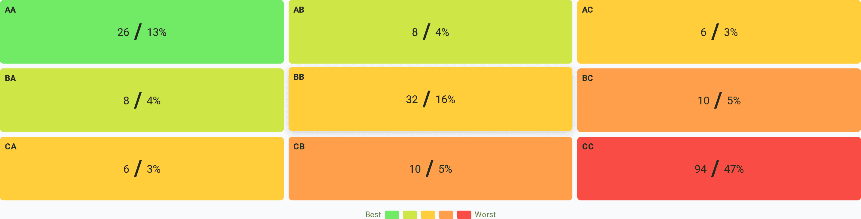
The nine cells came out like this:
- AA — 26 items, AB — 8, AC — 6;
- BA — 8, BB — 32, BC — 10;
- CA — 6, CB — 10, CC — 94.
Look at the proportion: the diagonal holds 152 items out of 200, meaning that for three quarters of the assortment both letters agreed. The disagreements are the remaining 48 rows, and the sharpest of them (AC and CA) are only 12. There is little that is interesting in the matrix, but it is expensive: those twelve rows are why the second column was added at all. If the letters always agreed, complex analysis would not be needed.
The cell colour runs from green to red, with "Best" and "Worst" labels. It is worth reading as "more contribution — less contribution" rather than as a verdict on the product: the method measures contribution to the metrics you chose and knows nothing about margin or about why an item is in the assortment in the first place. We will come back to the red corner of the matrix.
One more thing that is easy to misread. A matrix cell holds the number of items and their share of the assortment — not the share of revenue. These are the two shares people constantly confuse: "AA — 13%" means 13% of the rows of the list, not 13% of the money. The money in AA is, on the contrary, almost 70%. A detailed walk-through of that trap is in the companion article.
And let me close a common misconception right away: the second letter is not about price. The code is made of ranks, not of values, and on its own it says nothing about the price level. In our file the average unit price in AA runs from 4 to 8 EUR — and exactly the same in CC: 4.8–6.7 EUR. Opposite cells, identical price. What does always speak about price is a disagreement between the letters: if an item landed in AC or CA, its price is sharply out of the middle — upwards or downwards. Below you can see it on specific rows.
Where the money is frozen: cell AC
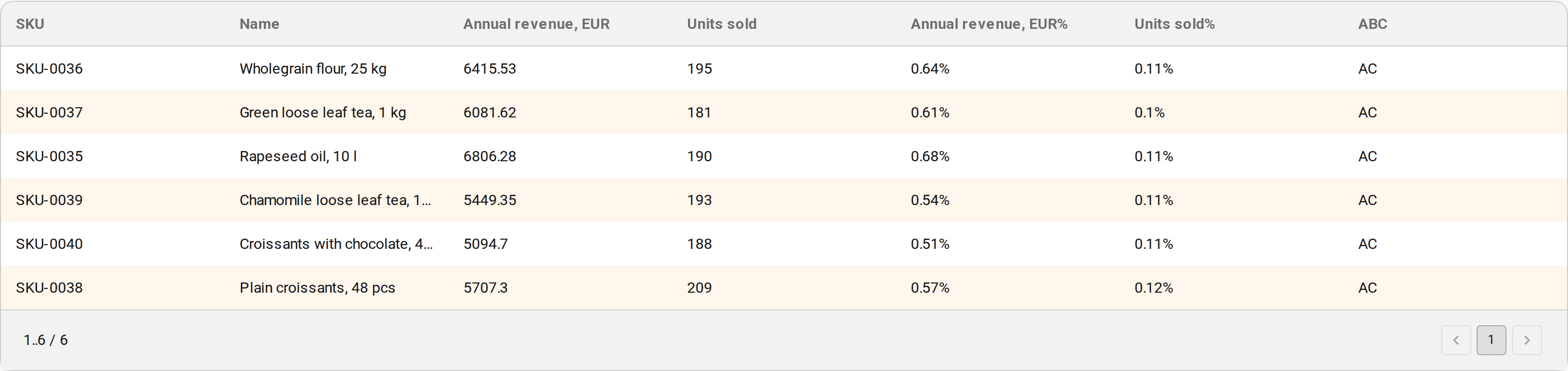
Six items. Class A by revenue, class C by quantity: 3.6% of annual revenue on 0.6% of all units sold.
Here they are in full, straight from the real report:
- rapeseed oil, 10 l — 6,806 EUR for 190 units;
- wholegrain flour, 25 kg — 6,416 EUR for 195 units;
- green loose leaf tea, 1 kg — 6,082 EUR for 181 units;
- plain croissants, 48 pcs — 5,707 EUR for 209 units;
- chamomile loose leaf tea, 1 kg — 5,449 EUR for 193 units;
- croissants with chocolate, 48 pcs — 5,095 EUR for 188 units.
The unit price here runs from 27 to 36 EUR against a median of 5.6 EUR across the whole file. This is what "expensive and rare" looks like: the revenue is gathered not by a flow but by a few dozen shipments.
What follows from that in practice:
- safety stock is counted in units, not in money. A couple of packs in the warehouse is already a noticeable sum, but at this sales frequency such a stock can cover months. This is exactly where frozen working capital usually sits;
- check how many buyers are behind that revenue. If those 190 shipments come from three customers, this is not a class A item but a dependency on three customers, and that is what you should be worried about, not the assortment;
- a stockout here is expensive but not immediately visible. An item may go unsold for two weeks simply because that is how the demand works — and going unsold because there is none left looks exactly the same.
And what not to do. Older write-ups on complex ABC usually advise "raise the price or increase sales" for items like these. The price here is already five or six times the assortment median — there is nowhere further to raise it, and "sell more" runs not into effort but into the nature of the demand: nobody buys 25 kg of flour every week.
What keeps the customers coming: cell CA
Six items as well — and the complete opposite of the previous ones. Class C by revenue, class A by quantity: 0.6% of revenue on 4.0% of all units sold.
This is water in 1.5-litre bottles (1,023–1,127 EUR for 1,200–1,350 units) and napkins in packs of a hundred. The unit price runs from 0.81 to 1.01 EUR, five or six times below the median of the file.
The main point about this cell: in a one-dimensional report by revenue all six items would land in class C and be the first candidates for delisting. The complex code shows that by quantity they are at the very top of the list — they are bought constantly, in almost every order. Removing them means removing not 0.6% of revenue but the reason some of the orders happen at all.
What is done with them:
- they are not delisted before their role in the order is examined. It is worth checking how many invoices contain such an item and what else is in them;
- price is handled carefully. This is exactly the case where price is a working lever: a small markup is multiplied by a large quantity. But the buyer's sensitivity to it is at its highest too, because the price of such a product is known by heart;
- the cost of servicing is counted. A cheap item with a large number of sales eats warehouse space, picker time and lines on invoices. Sometimes it pays better to enlarge the pack than to raise the price;
- availability is watched. A stockout here is noticed at once, and it hits the whole order.
AC and CA are mirror situations, and the decisions about them are opposite. That is why they must not be swept into a common "disagreements" bucket with one piece of advice for all: any such advice will be right for one cell and harmful for the other.
The core of the assortment: cell AA
Twenty-six items — 13% of the list. They account for 69.5% of revenue and 68.3% of units sold: large both in money and in volume. The single biggest row of the report is fusilli pasta in a five-kilogram pack: 49,730 EUR for 8,163 units.
This is what must not be lost, and the cost of a mistake here is at its highest — the same as in ordinary ABC. The difference is that the second letter adds confidence: the item is large not because of one-off deals but because of a flow. Items like these are kept in stock, they get priority in negotiations with the supplier, and their stock levels are checked most often.
The flip side is concentration: two thirds of the business rests on thirteen percent of the assortment. That is neither good nor bad, but it is a risk factor and it should be written down.
And one caveat, without which the report is read wrongly: AA is not "the best products", it is the most significant items in the two metrics you chose. The method knows nothing about margin — it sees exactly the columns you gave it. Run it again with margin in place of quantity and the composition of AA will change noticeably.
The intermediate cells: AB, BA, BC, CB
Thirty-six items whose letters diverged by one step. They are worked through on the same principle as AC and CA, only the conclusions are softer.
AB — 8 items, 7.2% of revenue on 3.4% of units. In our example these are large packs and premium items: biscuits in 3 kg packs, olive oil in five-litre canisters, ground coffee, muffins — from 10 to 15 EUR per pack. Big money at an average volume: what you look at is the stability of demand and whether the item drags excess stock along with it.
BA — 8 items, 3.5% of revenue on 7.9% of units. Pasta in half-kilogram packs, sauces, cream, jam — 2–3 EUR per unit. They move well and earn moderately. This is the nearest growth reserve: a small change in price or supply terms shifts their contribution noticeably precisely because the quantities are large.
BC — 10 items (1.9% / 0.9%) and CB — 10 items (0.9% / 1.9%). The same skews as in AC and CA, only weaker. They rarely need decisions of their own — you look at them when you are dealing with the strong cell next door.
The rule common to all six "divergent" cells: the wider the letters diverged, the further the item's price is from the rest of the assortment — and the more useful it is to look at that item separately.
The tail: cell CC, and when to leave it alone
Ninety-four items — almost half the list — on 3.3% of revenue and 3.4% of units sold. Little of either.
This is that red corner of the matrix labelled "Worst". This is also where reports are most often spoiled by the wrong wording. CC is not "loss-making items". ABC analysis knows nothing about losses: it splits the list by contribution to the metrics you gave it. "Little revenue and few units" and "generates losses" are entirely different statements, and the second does not follow from the first.
You can check that on our own file: the average unit price in CC is 4.8–6.7 EUR, exactly the same as in AA. The tail is not cheap junk and not damaged goods, it is items with a small contribution.
The right wording is softer and more useful: CC is where it is worth looking for candidates to delist, not a list of the condemned. Before removing an item, look at three things: its margin, its role in the assortment (whether people come for it and buy the rest along the way), and its age — a new product has not had time to build volume yet, but in the report it looks like the tail.
The practical meaning of this cell is a different one: ninety-four rows for three percent of the result is first of all a cost of management. Orders for them are worth consolidating and moving to automatic replenishment, and the buyer's attention is worth moving to where the cost of a mistake is higher.
How to get a report like this
You need an XLSX file with an identifier column (a code or a name) and two numeric columns holding metrics for one and the same period. The requirements for the data are the same as for ordinary ABC — they are covered in the companion article. The file is never uploaded anywhere: the calculation runs entirely in the browser.
The order is this:
- Open the file — by dragging it into the analysis window.
- Choose two columns. The order matters, and the file sets it: the first letter of the code comes from whichever of the chosen columns sits further left in the file. For us that is revenue, then quantity.
- Check the category thresholds — 80 / 15 / 5 per axis by default.
- Read the report: the matrix, the table and the recommendations.
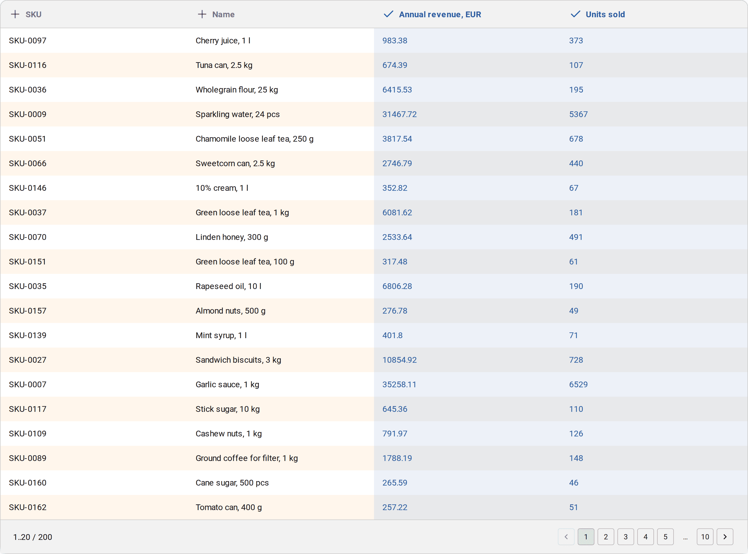
A matrix cell can be clicked, and the table below filters down to that code — that is exactly how the lists of items in the sections above were obtained. The table itself is your own file plus the columns added by the calculation: the item's share of each metric and the code assigned to it.
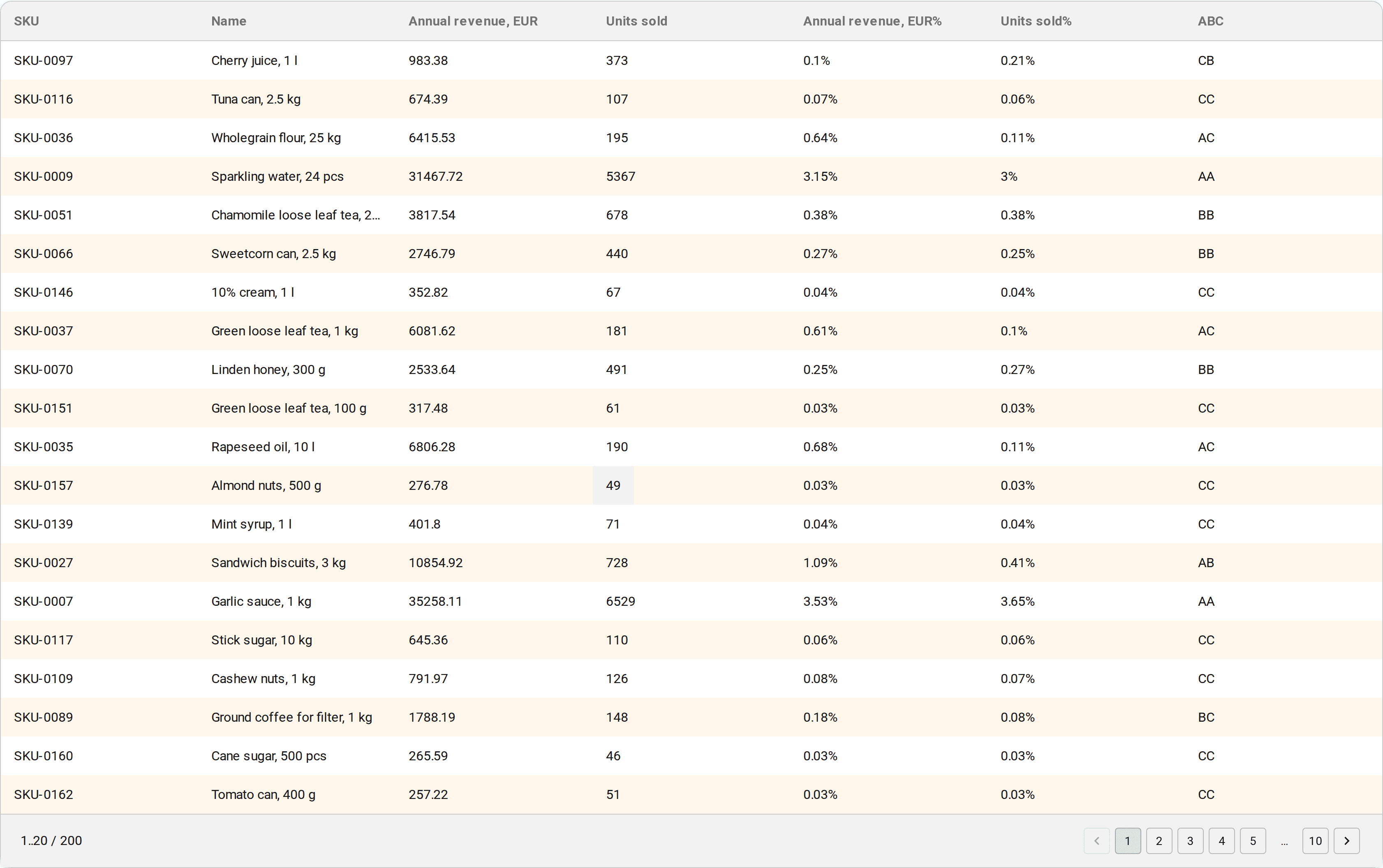
The report is saved to XLSX, so from there you can work on it with the usual tools — filters, pivot tables, or send it to your buyer.
Next to the report the product shows an analysis of what is worth doing about this structure. For complex analysis, two of the prompts are devoted to exactly the cells discussed above: "Items with code AC" and "Items with code CA". Both are described through the first and the second chosen metric rather than through revenue and units — and that is honest: the engine sees only the columns you gave it and knows nothing about what they mean. For the same reason the CA prompt states outright that the calculation does not assess the profitability of those items.
On our file there are seven prompts, and the panel shows the first four: the warning about the bloated tail, the prompt about CA, the portfolio-level "about 20% of items generate 80% of the result", and class A. The remaining three — class B, class C and the prompt about AC — open up through the "Show 3 more recommendations" line; in the screenshot below the list is fully expanded. Not every prompt can be clicked, only the ones carrying the filter icon: clicking one leaves in the table below only the rows that prompt is talking about. For AC and CA that is the six items of the corresponding cell, for the class prompts it is the whole class; the portfolio ones talk about the list as a whole and filter nothing.
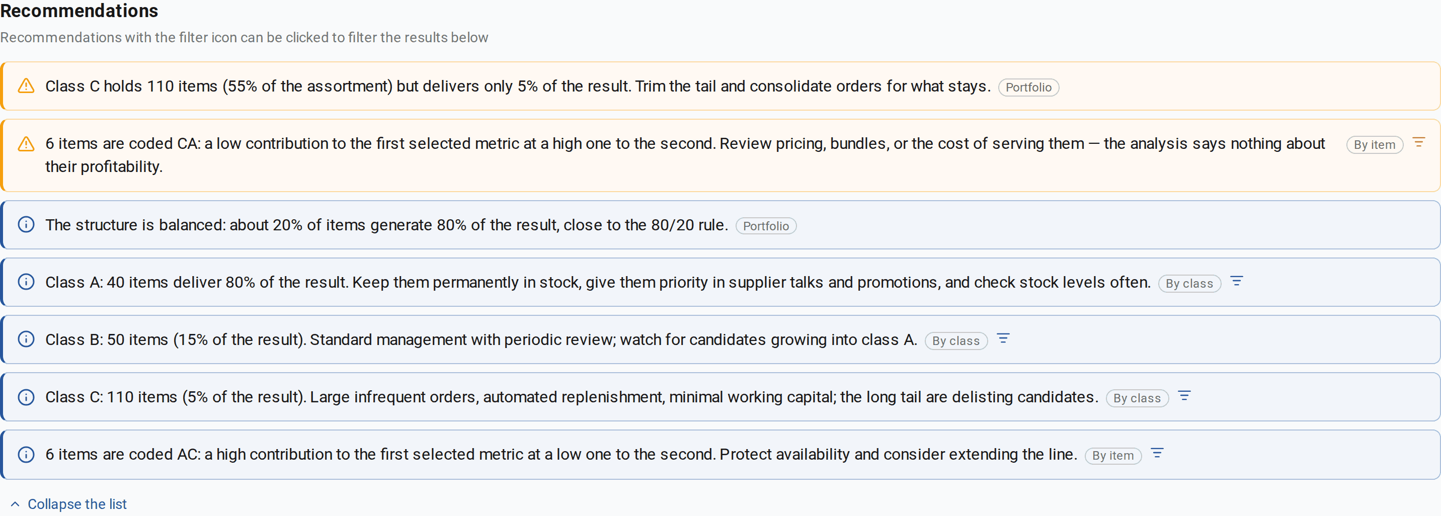
And an important detail: the advice itself is written on the assumption that the money metric comes first and the volume metric second. The text of a prompt does not depend on the order of the columns — it says "by the first metric" and "by the second" — but the advice does: "check prices, bundles and the cost of servicing" makes sense for a cheap product that is bought often. If quantity ends up to the left of revenue in your file, the codes in the matrix swap places and the advice goes to the wrong cell. One more reason to look at the column order before the calculation rather than after it.
What is easy to get wrong
- Not checking which column ended up first. The order comes from the file, not from the order of your clicks; without it the two-letter code is unreadable, and a month later the report is useless.
- Collapsing nine cells into four groups and giving each group one piece of advice. AC and CA land in the same bucket that way, although the decisions about them are opposite — and that loses the only thing the calculation was for.
- Reading CC as "loss-making". The method measures contribution, not profitability.
- Treating the second letter as a property of price. Price shows through only in the disagreements between the letters; where the letters match it can be anything.
- Confusing the two shares. The matrix holds the share of the assortment; the phrase "AA gives 70%" is about the share of revenue.
- Comparing runs with different thresholds or a different column order. Those are different reports, not a trend.
Where to go next
Complex ABC answers the question "what is large for us both in money and in volume", but it does not answer "how stable is that". An item can sit in AA and still sell in bursts — and that is a different conversation about stock. Stability is the job of XYZ analysis, which looks at how sales scatter across periods.
If you would like to see how a two-letter code is applied in management decisions on data that is not purely about products, there is a case study: the director of a medical centre works through a patient database with complex ABC and describes what they decided for each group and what came of it three months later.
And the easiest place to start is the very file you already have: if quantity sits next to revenue in it, the second column will not cost you a single extra minute of work — and the twelve rows in the corners of the matrix will almost certainly come as a surprise.