Why the coefficient of variation alone is not enough
XYZ analysis measures a single number — how far sales scatter around their own average. That is an honest answer to an honest question, but it has a limit: the spread does not say where it came from.
Take four items from the demonstration data set. All four land in the same XYZ class, Z:
- soy sauce, coefficient of variation 44.7%: sales grow almost every month, from 156 units in January to 739 in December;
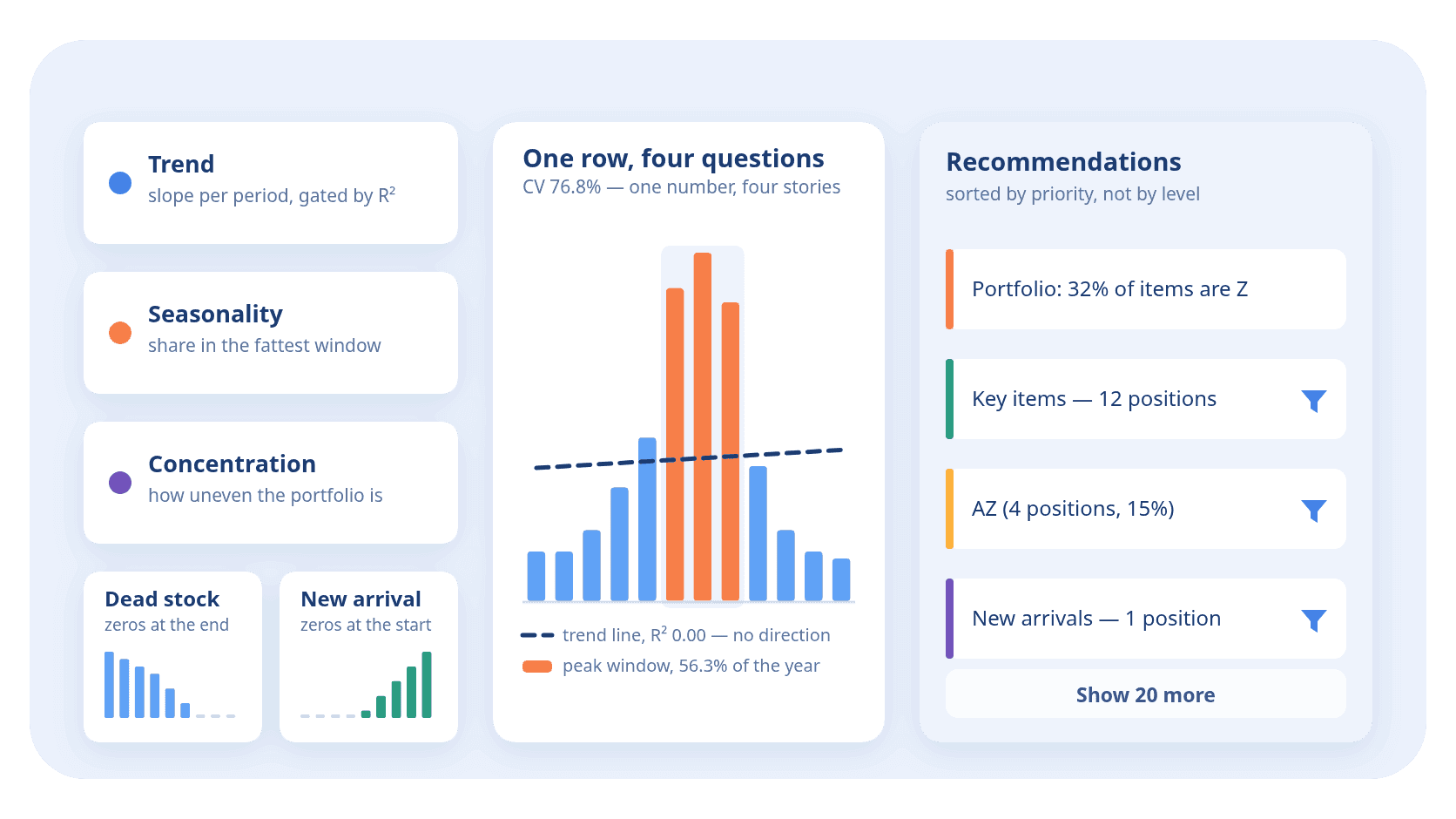
- 60/40 coffee blend, 76.8%: about 1,200 units a month in winter, 8,581 in July — exactly seven times more — and 1,051 again by December;
- white sugar, 81.5%: nine months of decline from 199 units down to 26, and zero for the last three months;
- couscous, 111.5%: five months of zeros, then sales from 29 up to 259 units.
One letter for four completely different situations. A growing item has to be bought ahead of demand, a seasonal one before the season, a fading one sold off, and a new arrival left alone to pick up speed. The letter Z says nothing about any of that — not because the method is poor, but because it answers a different question.
The tool calculates several more values from those same columns of yours in order to tell these cases apart. That is what this article is about.
Trend: a line through the points, and how far to trust it
The first thing that can be drawn out of a series is direction. A least-squares line is fitted through the points:
xᵢ = a + β · tᵢ
- xᵢ
- sales in period number i
- tᵢ
- the period number, from 0 to N − 1
- a
- the intercept, the level at the start of the series
- β
- the slope: how much sales change per period on average
The slope in units cannot be compared across items: +50 units a month is noise for an item that sells in thousands and explosive growth for one that moves in tens. So the slope is divided by the average and turned into a percentage per period: β / μ. That number is what the tool calls the trend.
But a slope has a treacherous property: there is always one. Some line passes through any cloud of points, and if you look only at the line, erratic demand is easily declared a decline and the item sent for discontinuation. So the direction is confirmed not by the slope but by how much the line actually explains your data:
R² = 1 − SSres / SStot
- SSres
- the sum of squared distances from the points to the line, what the line failed to explain
- SStot
- the sum of squared distances from the points to the average, the whole spread
- R²
- the share of the spread explained: 1 means the points lie on the line, 0 means the line explains nothing
The default thresholds are these. A trend is calculated at all from three periods and only when the average is not zero. A direction is confirmed at R² of at least 0.5: below that the line explains less than half the spread, and the tool says there is no direction. Then the slope itself is read: growth is more than +5% per period, decline less than −5%, and anything between the two is flat.
On the demonstration data set this shows on two items. For the soy sauce the slope is +12.8% per month at R² 0.97 — the line runs almost through the points, and the item is recognised as growing. For the coffee the slope is positive too, +1.2% per month, but R² equals 0.00: the summer hump and the winter dip are not explained by the line at all. No direction is confirmed — and rightly so, because there is no growth there.
Of the 120 items in the data set a direction is confirmed for exactly three: two growing, one fading. The other 117 are flat, and that is a normal result: most items genuinely have no trend.
Seasonality: the fattest contiguous window
The coefficient of variation cannot tell a seasonal item from an erratic one — both fluctuate. What separates them is not the size of the swing but where the volume sits: a season is several consecutive periods, erratic demand is scattered spikes.
So a contiguous window slides along the series, and the share of the volume inside the fattest one is measured:
P = Sw / S
- P
- the peak share: how much volume gathers in the best window
- Sw
- the volume of the best window: the fattest stretch of consecutive periods
- S
- the volume of the whole series: the sum of all the periods in the row
The thresholds: seasonality is evaluated from six periods — on a shorter series a "quarter-length window" degenerates. An item counts as seasonal when the peak window holds 45% of the volume or more.
For the coffee in the data set the June–August window holds 56.3% of the annual sales — a seasonal item, and exactly why it cannot be planned from a yearly average.
And now the honest caveat, without which this section would be a deception. On one year of data the metric sees not a season but peakiness: a one-off summer promotion looks exactly like a season that recurs year after year. Telling them apart needs at least two cycles and a test for recurrence, and the tool does not do that today.
The consequence shows on the same data set. Three items carry the seasonality flag, and only one of them is about a season:
- for the coffee the peak window is June–August, a genuine summer rise;
- for the sugar the best window fell on January–March with a share of 52.5% — but that is not a season, it is the start of a nine-month decline: the year began with the highest sales because everything after was lower;
- for the couscous the window is October–December, 67.1%: not a season either, but the first months of a new arrival's life.
The tool partly insures itself: dead stock never reaches the peak hint, so the sugar does not get there. The new arrival does — and its card has to be read together with the card about new arrivals.
Dead stock and a new arrival: the same zeros, opposite decisions
Two items can have the same share of zero periods and demand opposite actions. Everything turns on where exactly the zeros sit.
The tool counts three things: how many periods have no sales at all, how many of them run consecutively at the end of the series, and how many at the start.
Dead stock is an item with no sales for three consecutive periods or more, or one where zeros make up 70% or more and there were no sales in the last period. The sugar in the data set qualifies on the first condition: the last three months are zero. The decision is to sell off the remainder and stop replenishing.
A new arrival is the mirror case: zeros at the start of the series, with a sale in the last period or the one before it. The couscous qualifies exactly: five zeros at the start and sales growing through December. The decision is the opposite — do not discontinue it, let it pick up speed, and do not judge it by the class it earned on an incomplete year.
Their zero shares are close — three against five out of twelve — and a rule built on that share alone would send the new arrival out together with the dead stock. That is why every signal here is anchored on recency: what matters is not how many zeros there are but which side they are on.
Portfolio concentration: how unevenly the list is built
The previous metrics look at one row. This one looks at the whole list at once and answers how unevenly the contribution is spread.
Four numbers are calculated:
- how many items make up 80% of the volume — in the demonstration data set 24 items out of 120, that is 20% of the list. Almost the literal 80/20 rule;
- the share of the largest item — 7.0%;
- the share of the top 10% of items — the twelve largest give 57.4% of the volume;
- the Gini coefficient — 0.735. It is a measure of inequality: zero would mean every item sells the same, and the limit for a list of 120 items is 0.992, when everything rests on a single row.
On their own these numbers prescribe nothing — they say what kind of assortment you have. If 80% is made up by two items, you depend on two deliveries. If it takes eighty, the tail is too long and working it item by item will not pay off. These are the numbers behind hints such as "the structure is balanced" or "the tail is bloated".
Where this shows in the interface

Below the report table the tool shows a panel of hints. None of the metrics described above becomes a column of the report or reaches the export — there is no trend there, no R², no peak-window share. They live only here, in the wording of the cards.
How the panel is built:
- The list is flat and sorted by importance, not grouped by level: the critical findings first, then the rest by size of contribution. Grouping would push an important finding down, below general remarks about structure.
- The first four cards are shown by default, the rest sit behind a "Show more" button. On the demonstration data set the tool produced 24 hints, so twenty stay behind the button.
- Every card is tagged with its level — "Portfolio", "By class" or "By item".
- A card with a filter icon can be clicked, and the table below it will show only the rows the card is talking about. The ones that can be clicked are those with a concrete set of rows behind them: on this data set, 21 cards out of 24. Three cannot, and they talk about the structure of the whole list — there is nothing to filter there, it is the whole list.
What the hints are about
There is no need to list them all — what matters is the three levels they come in.
About the portfolio as a whole. What percentage of the assortment is class Z, how big the tail is, whether the structure is close to the 80/20 rule, whether class C is bloated. This is a conversation about the shape of the list, and the decisions are strategic: cut the assortment, change the stock policy.
About classes and cells. What to do with class A, with class X, with the AZ cell, with the CZ cell. Here the hint repeats what is covered in the article on the XYZ+ABC matrix, but with your own numbers: how many items are in the cell and what share of the result they give.
About individual items. Key products, candidates for discontinuation, items with a pronounced peak, growing items in the lower classes, new arrivals. These are the most useful cards: behind each is a short list of rows that opens with one click.
The set of cards depends on your data: if there is not a single new arrival in the file, there will be no card about new arrivals. Two different files therefore give different panels, and the number 24 above is about this file, not about the tool.
What the tool does not do
The list is short but important — it marks the boundary of trust.
- It does not forecast. None of the metrics says how much you will sell next month. A trend describes the past; it does not predict the future.
- It does not order and does not calculate a reorder point. A hint says "hold a safety stock", but how much to hold depends on lead times, batch sizes and service levels, none of which are in your file.
- It does not know the context. A promotion, an out-of-stock spell, a large customer leaving, a change of supplier — to the tool these are just numbers in cells. An item that was unavailable for half a year looks like a fading one, although the demand for it has not gone anywhere.
- It does not separate a season from a one-off spike on a single year of data — see above.
- It sees nothing beyond the selected columns. No stock on hand, no purchase prices, no margin: if they are not in the file, they are not in the conclusions.
How to use this
The order that works.
- Read the portfolio cards first — they give the whole picture and, along the way, suggest whether the analysis thresholds are worth changing at all.
- Then click the item-level ones and look at the rows themselves. The card "candidates for discontinuation — 1 item" is useful precisely because a specific item stands behind it, not advice in general.
- Check every finding against what you know. The tool does not know that the couscous is a new line you took on a month ago for one particular customer; it only knows the zeros are at the start. If it matches your picture of the world, act on it; if it does not, look for the reason in the data.
- Do not decide on a single card. "An item in CZ" and "an item is growing" can refer to the same row and suggest opposite things. That is not the tool contradicting itself but two different views of one situation, and choosing between them is your job.
And the main thing: the hints are a sorted list of places worth looking at, not a list of commands. Their value is in saving you the reading of a hundred and twenty rows, not in making the decision for you.
What next
The three articles in the series answer three different questions about the same file: how predictable the demand is, how much an item brings in, and what stands behind that.
- What XYZ analysis is — in plain language — where it all starts;
- XYZ+ABC analysis: two letters instead of one — the matrix of nine cells and the decision for each;
- What ABC analysis is — in plain language — the other half of the code.
Take a look at your own file
Upload your monthly sales and read the hints under the report — they are calculated on your own periods. The calculation runs right in your browser; the file is never sent anywhere.
Open XYZ+ABC analysis